Loop
Flexible and Expressive CSS
Aiming to create a more maintainable and readable CSS
npm install oo-loopFully customizable
Loop is a fully customizable CSS framework built with Sass. It gives you complete control on your project to let you create and match your styles with your design needs.
Single Configuration
No endless list of variables, Loop offers easy management and access to all configuration in a single map.
Separation of concerns
Loop differentiates components and utilities with semantic for more clarity
- oo-componentName / data-oo-componentName for component attributes
- .prefixName-valueName for utility classes
Quick Element Layout
// _config.scss
@import 'oo-loop/loop';

@include ooCreate((
  palette: (
    'white': #fff,
  ),
  column: (
    gutter: 1rem,
  ),
));
<!-- App -->
<div oo-row>
  <div oo-col="fit">
    <img src="orange.jpg" width="85" alt="oranges" />
  </div>
  <div oo-col class="color-white">
    <h3 class="mt-0">Orange <small class="color-secondary">/ˈɒrɪn(d)ʒ/</small></h3>
    <p>A large round juicy citrus fruit with a tough bright reddish-yellow rind.</p>
  </div>
</div>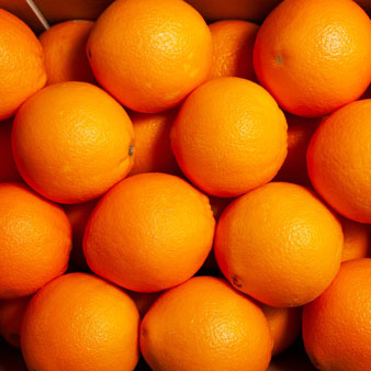
Orange /ˈɒrɪn(d)ʒ/
A large round juicy citrus fruit with a tough bright reddish-yellow rind.
Simple Responsive Template Design
// _config.scss
@import 'oo-loop/loop';

$ooLoop: ooSet('template.areas', (
  'home': (
    rt: (
      "header"
      "nav"
      "main"
      "widgets"
      "footer"
    ),
    sm: (
      "header header header"
      "nav main main"
      "nav widgets widgets"
      "footer footer footer"
    ),
    md: (
      "header header header header"
      "nav main main widgets"
      "nav main main widgets"
      "footer footer footer footer"
    ),
    lg: (
      "header nav nav"
      "main main widgets"
      "footer footer widgets"
    ),
  )
));
$ooLoop: ooSet('template.gap', 1rem);

@include ooCreate();
<!-- App -->
<div oo-template="home">
  <div oo-area="header">Header</div>
  <div oo-area="nav">Nav</div>
  <div oo-area="main">Main</div>
  <div oo-area="widgets">Widgets</div>
  <div oo-area="footer">Footer</div>
</div>
Easy Use of Config Data
// style.scss
.hero {
  padding: oo('container.gutter.rt');
  display: flex;
  min-height: 300px;
  align-items: center;
  text-align: center;
  color: #fff;
  background-color: oo('palette.primary');

  @include breakpoint(sm) {
    padding: oo('container.gutter.sm');
    text-align: left;
  }
}
/** Generating style.css **/
.hero {
  padding: 1rem;
  display: flex;
  min-height: 300px;
  align-items: center;
  text-align: center;
  color: #fff;
  background-color: #28a6c7;
}
@media (min-width: 37.5em) {
  .hero {
    padding: 1.5rem;
    text-align: left;
  }
}
Like a companion, Loop supports your development, giving you the tools to make it your own.
Loop encourages the use and creation of utilities while considering making components for recurring styling.
Take Advantage of Utilities
Adjust your Needs - Build Rapidly
// _config.scss
@import 'oo-loop/loop';

$ooLoop: ooPipe(
  _add('palette', (
    'lavender': #a172bf,
    'white': #fff,
  ),

  _add('wrapper', (
    values: (
      'tiny': .5rem
    ),
    screens: 'md'
  )),

  _set('utilities', (
    display: (
      prefix: 'd',
      values: 'block'
    ),
    letterSpacing: (
      prefix: 'text',
      values: (
        'wide': .5px,
      ),
    ),
    overflow: (
      values: (
        'hidden',
      )
    ),
    shape: (
      property: 'border-radius',
      values: (
        'squircle': 1em,
        'stadium': 50em,
      ),
    ),
  ))
);

@include ooCreate();
<!-- App -->
<div class="bg-white text-center shape-squircle overflow-hidden">
  <time datetime="2020-09-07 10:00"
    class="d-block wrapper-tiny bg-lavender color-white font-small text-uppercase">
    September 7th, 10am
  </time>
  <div class="wrapper-small wrapper-medium@md">
    <h3 class="mt-0 mb-0">Frontend Developer Festival</h3>
    <p class="text-wide">Tokyo, Odaiba, Big Sight</p>
    <button class="shape-stadium" oo-button="lavender outline">Join</button>
  </div>
</div>
Frontend Developer Festival
Tokyo, Odaiba, Big Sight
Turn recurring style into Component
Make Html more Readable
// _config.scss
@import 'oo-loop/loop';

$ooLoop: ooAdd('components', (
  'notification': (
    props: (
      padding: 1rem,
      border-left-width: 5px,
      border-left-style: solid,
    ),
    variants: (
      'success': (
        color: #015a31,
        border-color: #83cca9,
        background-color: #c8f7e1,
      )
      'danger': (
        color: #5a0101,
        border-color: #ca7878,
        background-color: #f7c8c8,
      ),
      'warning': (
        color: #77490b,
        border-color: #d69d50,
        background-color: #f7f3c8,
      ),
      'centered': (
        text-align: center,
        border-left: 0,
        border-top-width: 5px,
        border-top-style: solid,
      ),
      'right': (
        text-align: right,
        border-left: 0,
        border-right-width: 5px,
        border-right-style: solid,
      )
    )
  ),
));

@include ooCreate();
<!-- App -->
<div oo-notification="success centered">
  <strong>Hey, well done!</strong><br>
  You've created a notification component.
</div>
<div oo-notification="danger">
  <strong>Oops!</strong><br>
  You've created a notification component.
</div>
<div oo-notification="warning right">
  <strong>Beware!</strong><br>
  You've created a notification component.
</div>
You've created a notification component.
You've created a notification component.
You've created a notification component.
Develop Component with more Freedom
Pure Scss coding with Mixins
// index.scss
@import 'config';

@include ooComponent('weather') {
  padding: 15px;
  display: flex;
  align-items: center;
  font-size: 1.3rem;
  line-height: 1;
  color: #fff;

  &::before {
    margin-right: 15px;
    content: '';
    width: 45px;
    height: 45px;
  }

  &::after {
    margin-left: auto;
    content: attr(data-degree)'\00B0';
    font-size: 3rem;
    font-weight: 200;
    white-space: nowrap;
  }

  & + & {
    margin-top: 15px;
  }
}

@include ooComponentVariant('weather', 'celsius') {
  &::after {
    content: attr(data-degree)'\2103';
  }
}

@include ooComponentVariant('weather', 'fahrenheit') {
  &::after {
    content: attr(data-degree)'\2109';
  }
}

@include ooComponentVariant('weather', 'sunny') {
  background-color: #36c2dd;
  &::before {
    background-color: #fff789;
    border-radius: 50%;
    box-shadow:
      0 0 10px 0 yellow,
      0 0 0 1px #ffdd40;
  }
}
@include ooComponentVariant('weather', 'clear') {
background-color: #212240;... }
@include ooComponentVariant('weather', 'rainy') {
background-color: #84a4cc;... }
@include ooComponentVariant('weather', 'snowy') {
background-color: #92bace;... }
@include ooComponentVariant('weather', 'night') {
background-color: #212240;
}
<!-- App -->
<div oo-weather="sunny" data-degree="28">
  <span>Marseille<br><small>Sunny</small></span>
</div>
<div oo-weather="rainy" data-degree="8">
  <span>Edinburgh<br><small>Rainy</small></span>
</div>
<div oo-weather="clear celsius" data-degree="14">
  <span>Tokyo<br><small>Clear Night</small></span>
</div>
<div oo-weather="rainy night celsius" data-degree="5">
  <span>Sapporo<br><small>Rainy</small></span>
</div>
<div oo-weather="snowy fahrenheit" data-degree="32">
  <span>La Crosse<br><small>Snowy</small></span>
</div>
Sunny
Rainy
Clear Night
Rainy
Snowy
Why Loop?
The first iteration of Loop (0.4) focused on bringing the minimum to bootstrap any project. Instead of providing any possible existing components, Loop worked towards flexibility and customization to let the developer manage his own set of utilities; thus, making the CSS easier to maintain. Loop also introduced a new component syntax to improve HTML readibility making styling code more expressive and less confusing.
Loop v1 continues into the same philosophy tackling this time the variables situation. What we often get from a css framework, is a list of single variable to customize elements or components properties. The list, trying to cover a multitude of parameters, tends to be exhaustive and can become painful while searching for a possible change.
Loop proposes to treat the variables as a single structured map to facilitate its use. As the result, the config map is enabling easy parsing and access to all the data during the development. Moreover, the introduction of properties such props and states offers a complete control over the style of elements and components. It is simplifying its customization by allowing you to add whatever CSS properties you need without worrying if it's changeable or not.